How to Optimize Your Blog for Mobile Users

With the increasing number of people accessing the internet via mobile devices, it’s crucial to ensure your blog is optimized for mobile users. A mobile-friendly blog enhances user experience, boosts SEO rankings, and keeps your readers engaged. Here are some effective strategies to optimize your blog for mobile users.
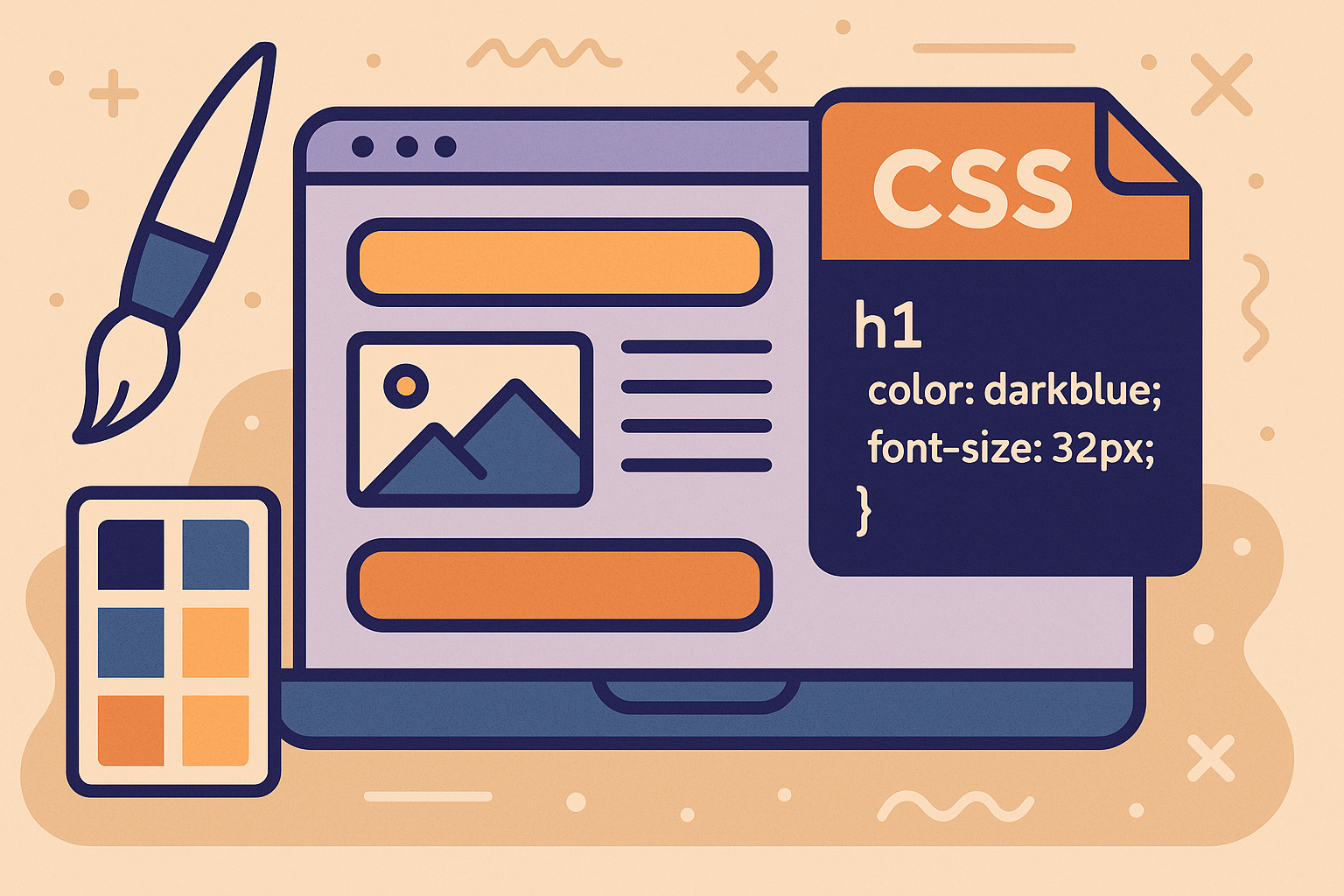
1. Choose a Responsive Design
A responsive design adjusts the layout based on the device’s screen size, providing a seamless user experience across all devices.
Key Techniques:
- Responsive Themes: Use a responsive theme that automatically adapts to different screen sizes.
- Media Queries: Implement CSS media queries to apply different styles for various devices.
- Flexible Grid Layouts: Use flexible grid layouts that adjust according to the screen width.
2. Optimize Loading Speed
Choosing the best blog hosting service is also crucial, as a reliable host can significantly impact your site’s speed and uptime. Fast loading times are essential for retaining mobile users and improving search engine rankings.
Key Techniques:
- Image Optimization: Compress and resize images to reduce load times without sacrificing quality.
- Lazy Loading: Implement lazy loading to delay the loading of off-screen images until the user scrolls down.
- Minimize HTTP Requests: Reduce the number of HTTP requests by combining files and using sprites for images.
- Browser Caching: Enable browser caching to store frequently accessed files locally on users’ devices.
3. Simplify Navigation
Simplified navigation ensures mobile users can easily find what they’re looking for on your blog.
Key Techniques:
- Mobile-Friendly Menu: Use a mobile-friendly menu, such as a hamburger menu, that expands when tapped.
- Clear Navigation Labels: Use clear and concise labels for navigation links.
- Sticky Navigation: Implement sticky navigation bars that remain visible as users scroll down the page.
4. Improve Readability
Ensuring your content is easy to read on small screens is crucial for a positive user experience.
Key Techniques:
- Font Size: Use a font size that is large enough to be read comfortably on mobile devices.
- Line Spacing: Increase line spacing to avoid text congestion.
- Contrast: Ensure high contrast between text and background for better readability.
5. Optimize Forms and Interactive Elements
Optimizing forms and interactive elements enhances usability and engagement for mobile users.
Key Techniques:
- Touch-Friendly Buttons: Use large, touch-friendly buttons that are easy to tap.
- Simple Forms: Simplify forms by reducing the number of fields and using dropdowns where possible.
- Auto-Fill and Input Masks: Implement auto-fill and input masks to make form filling quicker and more accurate.
6. Prioritize Content Layout
Organize your content layout to ensure the most important information is easily accessible on mobile devices.
Key Techniques:
- Single Column Layout: Use a single column layout to ensure content flows naturally on smaller screens.
- Prioritize Above-the-Fold Content: Place the most important information above the fold to capture users’ attention immediately.
- Expandable Sections: Use expandable sections (accordions) for longer content to keep the layout clean and manageable.
7. Test on Multiple Devices
Testing your blog on various devices ensures it performs well across different screen sizes and operating systems. Remember to also test your website security measures during this process to ensure your blog remains protected against vulnerabilities.
Key Techniques:
- Device Testing: Regularly test your blog on different mobile devices, including smartphones and tablets.
- Emulators: Use online emulators to simulate how your blog appears on various devices.
- Feedback: Gather feedback from mobile users to identify and address any usability issues.
Conclusion
Optimizing your blog for mobile users is essential in today’s digital landscape. By implementing a responsive design, improving loading speed, simplifying navigation, and ensuring readability, you can create a mobile-friendly blog that provides a seamless user experience. Regular testing and user feedback will help you continuously refine your blog’s mobile performance.


Post Comment